
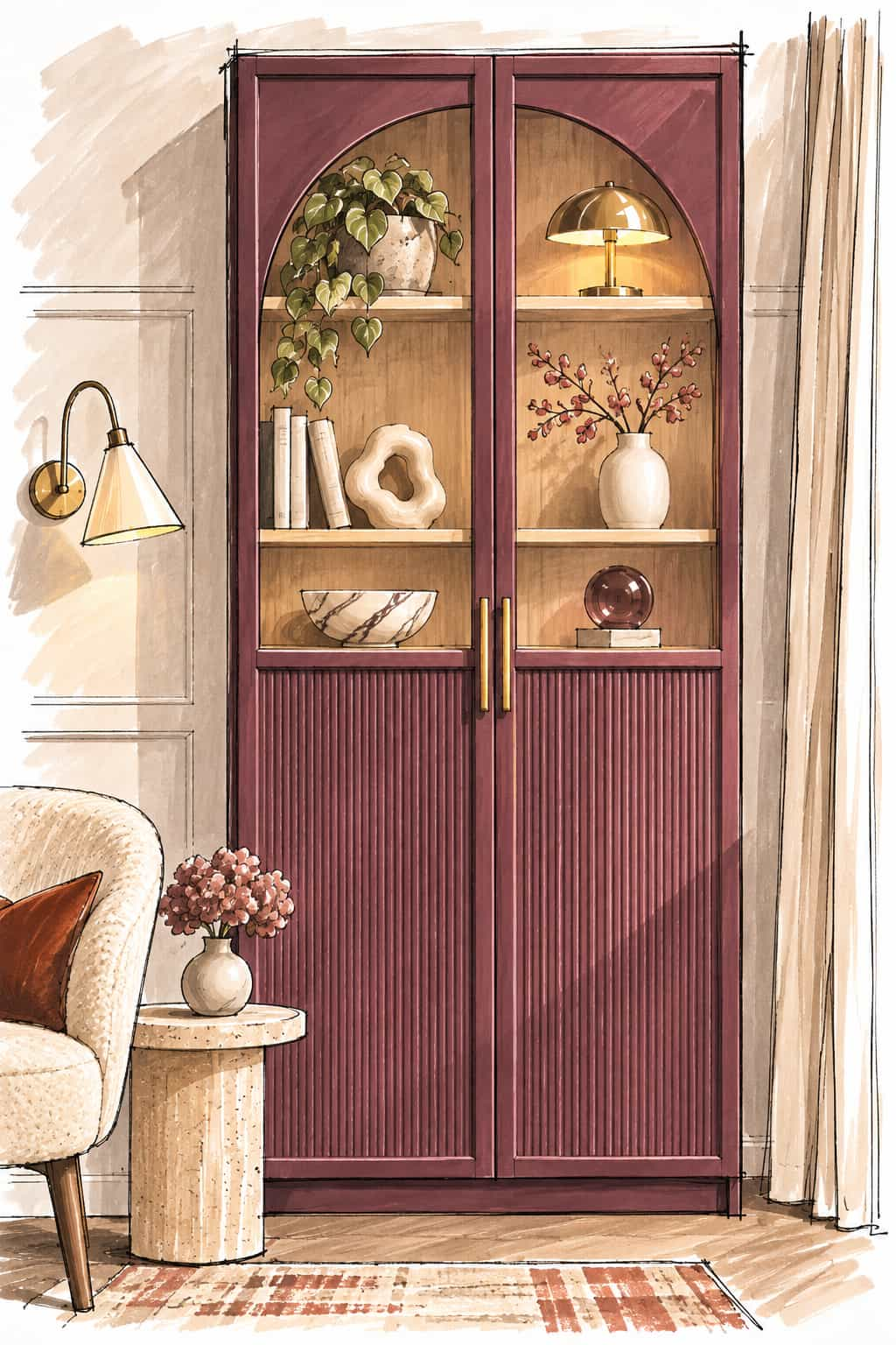
Deep burgundy paint, elegant curved glazing and finely fluted doors give this IKEA BILLY cabinet a completely different character. The combination has a slightly vintage feel, particularly with the long brass handles and contrasting walnut-effect interior.
The interesting thing about this design is how much of the transformation could be achieved without replacing the existing doors. Using IKEA’s BILLY bookcase with OXBERG panel-and-glass doors as a starting point, the arches and fluted detailing could be added as decorative overlays.
This original Hacksaholic illustration explores how the idea might work, along with the materials and methods I’d consider for recreating it.
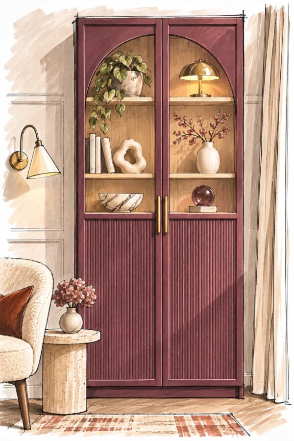
Starting With an IKEA BILLY/OXBERG Cabinet
For this particular design, I’d start with the 80 × 30 × 202 cm BILLY/OXBERG bookcase in brown walnut effect.
It has two tall doors with glazed upper sections and solid lower panels, making it a suitable starting point for the proposed makeover.
The walnut-effect finish is another advantage.
Rather than trying to recreate the timber appearance using wallpaper or veneer, you could retain the existing interior finish and paint the outside of the cabinet. This would give you the contrast between the burgundy exterior and warm timber-look shelves without unnecessarily complicating the project.
I’d be careful to mask the interior neatly when painting, particularly around the front edges of the cabinet and the areas visible through the glass.
Creating the Arched Glass-Door Effect
The arches are what give this design its distinctive appearance.
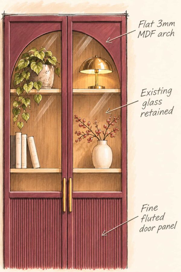
My preferred approach would be to make the decorative surrounds using 3mm MDF, rather than attempting to alter the existing glass panels.
I’d start by making a cardboard template for the curve, adjusting it until the proportions look right. It’s worth taking some time over this because the two arches need to mirror each other neatly when the doors are closed.
Once the shape is established, the template could be transferred to the MDF.
The idea would be to cut four matching pieces: a front and back arch for each glazed door.
I’d sand the cut edges, prime the MDF and finish the pieces in the same burgundy paint as the cabinet before installing them.
One possible fixing method is to use a suitable clear glazing sealant to bond the decorative pieces around the glass. However, the adhesive would need testing for compatibility and secure adhesion to the finished MDF and glazing. I’d also look at whether the existing door frames could help retain the pieces, rather than relying entirely on a bond to the glass.
The glass itself would remain unchanged.
Adding Fluted Panels to the Lower Doors
The lower half of the OXBERG doors already provides a solid panel, so there’s no need to replace the entire door to introduce the fluted effect.
I’d look for thin, paintable fluted panelling that could be cut to fit inside the existing door frame.
The narrow vertical profile is an important part of the design. It creates an elegant texture that works with the curved glazing, whereas wider battens would produce a noticeably different, more contemporary appearance.
Thickness and weight are worth checking before choosing a product. Many fluted wall panels are quite substantial, and adding too much material to an existing cabinet door could affect its operation.
Once a suitable lightweight panel has been found, the proposed approach would be to cut it accurately, bond it to the lower section using an appropriate adhesive and finish it in the same colour as the surrounding door.
Getting the Burgundy Finish Right
For this cabinet, I’d choose a deep, slightly muted burgundy with warm brown undertones. It complements the walnut-effect interior beautifully and gives the cabinet a richer, more traditional appearance.
A couple of paint colours worth considering are:
- Sherwin-Williams Cordovan (SW 6027) — a good starting point for exploring the deeper, moodier side of this colour scheme.
- Benjamin Moore New London Burgundy (HC-61) — another option worth sampling.
These are suggested colour directions rather than exact matches to the illustration.
My recommendation would be to take a copy of the illustration to a local DIY store or paint supplier and have a suitable colour mixed to match. It’s a useful way to get closer to the particular burgundy you’re after, especially when the design falls somewhere between red, brown and purple.
I’d still test the mixed colour on a sample board before committing. Burgundy can change considerably between daylight and warm artificial lighting.
For the finish itself, I’d favour a durable satin or eggshell-style furniture paint. The slight sheen would help bring out the texture of the fluted panels without making the cabinet excessively glossy.
Because the BILLY/OXBERG uses foil-faced surfaces, preparation is particularly important. Clean and prepare the surfaces according to the coating manufacturer’s instructions, use a compatible adhesion primer, and then apply the chosen furniture paint.
Remember that choosing the right colour and choosing the right paint system are two separate decisions. A colour-matched finish still needs to be suitable for the surface it’s going onto.
Finishing the Design With Brass Handles
The long brass handles provide a useful contrast against the dark paint.
I’d favour relatively slim, simple pulls rather than ornate traditional handles. The design already has plenty of detail in the arches and fluted panels.
Brushed or satin brass would be my preference, although polished brass could work if you wanted something more dramatic.
Before ordering, check the fixing-hole centres, the overall handle length and whether the new handles will cover any existing holes.
Two Alternative Ways to Style This IKEA BILLY Cabinet
The arched glazing and fluted lower panels work with surprisingly different colour combinations. Keeping the basic construction the same, these two alternatives show how changing the paint, interior finish and surrounding décor can give the cabinet a completely different personality.
1. Golden Yellow with Graphic Stripes
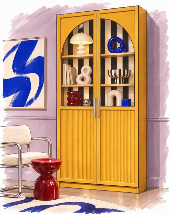
For a bold, contemporary interpretation, a rich golden-yellow finish makes the cabinet an immediate focal point.
The black-and-cream striped interior creates a striking contrast, while natural timber shelves help break up the pattern. Slim chrome handles add a cleaner, more modern finish.
I particularly like how this combination works against soft lilac walls, with sculptural furniture and vibrant artwork introducing further colour without competing with the cabinet.
To recreate the look, I’d start with a light-coloured BILLY/OXBERG, paint the exterior golden yellow and apply striped wallpaper to the interior back panel. A satin finish would work particularly well, catching the light on the fluted doors.
The key is keeping the stripes confined to the interior. This gives the design plenty of character without making it overly busy.
2. Buttercream with Floral Wallpaper and Powder Blue
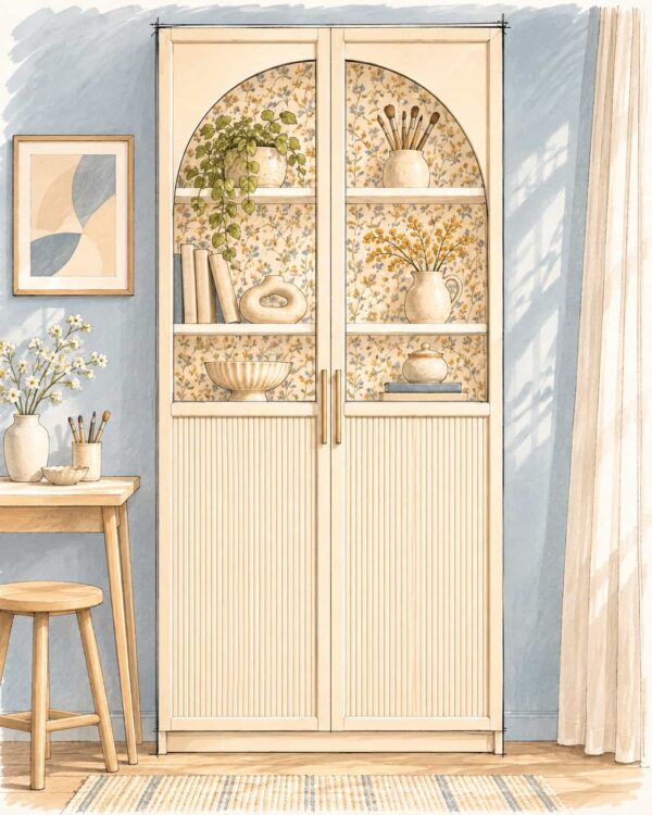
For something lighter and more playful, this version combines a soft buttercream finish with delicate floral wallpaper and powder-blue surroundings.
The pale yellow cabinetry gives the arches and fluted panels a softer appearance, while the patterned interior introduces subtle colour and texture.
I particularly like the combination of warm cream, muted blue and touches of ochre. It feels fresh and contemporary without relying on particularly bold colours.
This could be a relatively straightforward variation to achieve using a white BILLY/OXBERG as the starting point. The exterior could be painted a warm buttercream shade, with wallpaper applied to the interior back panel.
I’d keep the shelves light and use simple brass handles to complement the warm tones.
Of the two alternatives, this is probably the more versatile choice for smaller or lighter rooms, while the golden-yellow version would make a much stronger statement.
What I’d Check Before Starting
Although the individual modifications are fairly straightforward, there are a few things I’d want to establish before buying materials:
- Arch proportions: Make a full-size template and check how the two curves meet when the doors are closed.
- Glass and fixing method: Confirm that the chosen adhesive and installation method are suitable for the proposed decorative overlays.
- Panel thickness: Make sure the fluted material doesn’t interfere with the door frames, handles or hinges.
- Paint compatibility: Use a preparation and primer system suitable for the existing foil finish.
- Door weight and fixing: Check how the additional materials affect door movement and hinges, and follow IKEA’s wall-anchoring instructions.
I’d also check the exact cabinet dimensions before cutting anything, particularly if working with an older BILLY.
Final Thoughts
For me, the strongest feature of this design is the contrast between the curved glazing and the fine vertical fluting.
The arches soften the cabinet, while the fluting introduces texture and makes the lower doors feel more substantial. Against the warm walnut-effect interior, the burgundy finish gives the whole piece a much richer appearance.
It’s a concept that could turn a fairly familiar IKEA bookcase into a distinctive display cabinet, while retaining much of the original furniture.
I’m off to get my materials…
Design note: This is an original Hacksaholic illustrated concept, not a completed or tested build. The suggested methods should be checked against the actual furniture and materials before construction.